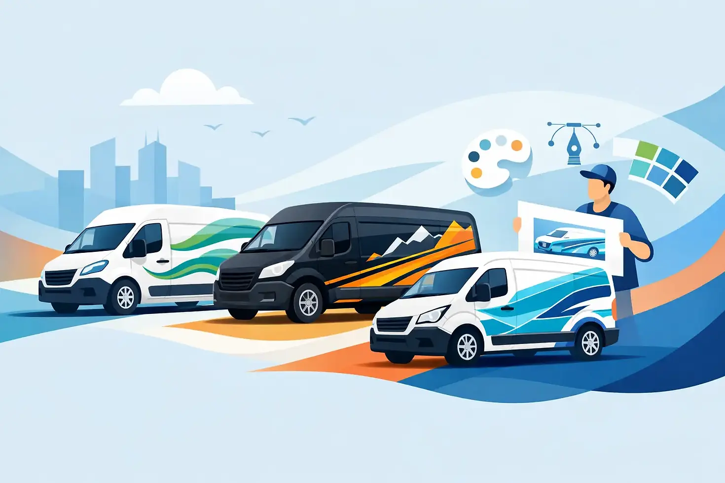
12 Custom Van Graphics Ideas That Work
- Tom Karolczak

- May 16
- 6 min read
A plain white van can disappear into traffic. A well-designed one gets remembered at the lights, outside a customer’s property, and parked on a busy high street. That is why custom van graphics ideas matter - not as decoration, but as a practical branding tool that can help your business look more established and easier to trust.
The right approach depends on what you want the van to do. Some businesses need strong local visibility. Others want a cleaner, premium look that reflects the standard of their service. The best graphics are not always the loudest. They are the ones that fit the vehicle, the brand and the day-to-day reality of how that van is used.
What makes van graphics effective
Good van graphics do two jobs at once. They need to attract attention quickly, and they need to stay readable in motion or from a distance. That means clever design usually beats crowded design.
A van only gives you a few seconds to communicate. If every panel is packed with text, logos, phone numbers, service lists and social icons, the main message gets lost. In most cases, a cleaner layout with a strong brand name, one clear service line and easy contact details works harder than trying to say everything at once.
There is also a practical side. Vans have handles, trims, fuel caps, sliding doors and body lines that can interrupt a design if they are not considered early. Graphics that look great on a flat screen can fall apart once they are fitted to a real vehicle. That is why a design should always be created around the specific make and model.
Custom van graphics ideas for different business goals
1. Full branded wrap for maximum visibility
If your van is on the road all day, a full wrap gives you the biggest visual impact. This suits trades, delivery businesses, event companies and any brand that wants broad local recognition.
A full wrap gives more room for colour, photography, bold typography and stronger brand presence. It can make even a standard fleet van look more professional and more established. The trade-off is cost. A full wrap is a larger investment than cut vinyl graphics, but for businesses that rely on regular road exposure, the return in visibility can justify it.
2. Partial wrap for a smart balance
A partial wrap is often the most efficient option. Instead of covering every panel, the design uses selected areas of the van to create shape, contrast and branding impact.
This works well when you want a premium look without the budget of a full wrap. A partial wrap can also be easier to update later if branding changes. Done properly, it looks intentional rather than stripped back. The key is to design it with confidence, not as a full wrap cut down at the last minute.
3. Bold logo and contact-led graphics
For many local service businesses, simple is best. A strong logo, business name, telephone number and website placed cleanly on the side and rear can be enough.
This style is particularly effective for electricians, plumbers, builders, cleaning firms and maintenance companies. It keeps the van professional and easy to read while avoiding visual clutter. If your business grows through word of mouth and local enquiries, this approach can work extremely well.
4. High-end minimalist branding
Not every van graphic needs bright colours and oversized text. Some brands benefit more from restraint. A darker base colour, subtle contrast graphics, refined typography and a small but confident logo can create a more premium impression.
This suits specialist contractors, luxury transport providers, property-related businesses and premium product suppliers. The trade-off is that minimalist branding often relies on stronger design discipline. If it is too subtle, it can lose impact. If it is done well, it looks polished and credible.
Custom van graphics ideas by style
Photo-based graphics
Large printed imagery can be very effective when the image quality is excellent and the service is visual by nature. Food businesses, florists, pet services and interior specialists can all benefit from showing what they do rather than just stating it.
The risk is poor reproduction or overuse. Low-resolution images, too many photos or badly cropped visuals can make a van look dated very quickly. This style needs strong print quality and careful layout to stay sharp.
Pattern and shape-led designs
Sometimes the best route is not a photo or a plain logo, but a graphic system built from shapes, stripes or repeated brand elements. This can help a van feel distinctive without becoming busy.
It works particularly well across fleets because the style stays consistent even if vehicles vary in size. It also gives branding more movement and character. For companies looking for something modern and recognisable, this is often a strong direction.
Text-first messaging
Some businesses want the service message to lead. Phrases like same day delivery, emergency callouts or specialist installations can be featured prominently if those points genuinely drive enquiries.
This can work, but only when the hierarchy is right. The business name still needs to be clear. Promotional text should support the brand, not overpower it. If every message is shouting for attention, none of it lands properly.
Matte and textured finishes
Not all van graphics ideas are about printed artwork. Material choice can change the whole feel of a vehicle. Matte laminates, satin finishes and selected textured films can give a van a more refined appearance while still carrying branding.
This is especially useful for brands that want to stand apart from standard gloss commercial vans. It is a more design-led choice, but when matched to the right business, it can make a strong impression.
Practical design choices that make a difference
The best van graphics are not built on looks alone. They need to work in everyday use.
Rear doors matter more than many businesses realise. In traffic, the back of the van is often the longest view another driver gets. If your key information only appears on the sides, you miss an obvious opportunity. The rear should carry your branding clearly, but still work around door splits, hinges and number plates.
Reflective elements can also be useful depending on the job. For businesses operating early mornings, evenings or roadside, reflective vinyl can improve visibility and add a safety benefit. It is not right for every design, but in the right setting it adds practical value.
Durability matters too. Commercial vans work hard, and graphics need to keep their finish through weather, washing and regular road use. Cheap materials may save money at the start, but lifting edges, fading print and poor adhesion create a more expensive problem later. High-quality vinyl and professional fitting are part of the result, not an extra.
Matching the graphics to the van
Different vans suit different design approaches. A compact van with limited panel space usually benefits from cleaner branding and sharper hierarchy. A larger panel van gives more room for creative layouts, larger imagery or stronger wrap coverage.
Body shape changes everything. Recessed panels, curved corners and sliding door tracks can interrupt logos and text if the design is not planned carefully. This is where experience matters. Graphics should be mapped to the actual vehicle so the finished result looks considered from every angle.
If you run a fleet, consistency becomes just as important as creativity. Every van should feel part of the same brand family, even if the layout is adapted to suit different models. That balance helps your vehicles look organised and professional across the road network.
When to keep it simple
There is a temptation to use every inch of a van because the space is there. In reality, restraint often produces the stronger result.
If your brand is already recognisable, or your work comes from local referrals, a clean design may do more for credibility than an overworked wrap. A tidy van with confident branding suggests a business that is established and reliable. For many customers, that first impression matters before they read a single word.
Simple also helps with longevity. Design trends move on, but clear branding tends to age better than novelty graphics or overcomplicated layouts. If you want a van that still looks current in three to five years, that should shape the design from the start.
Choosing the right route for your business
The best custom van graphics ideas start with practical questions. How often is the van on the road? Where does it park? Who is meant to notice it? Do you want more local enquiries, a stronger brand image, or a cleaner fleet appearance?
Once those answers are clear, the design becomes easier to judge. A full wrap may be right for one business and unnecessary for another. A minimalist approach may look excellent for a premium service brand, but too understated for a company that relies on quick recognition in busy areas.
At CarWrap24, the strongest projects usually come from combining creative design with proper production and fitting knowledge from the start. That one-stop-shop approach helps avoid the common gap between what looks good in theory and what performs properly on the vehicle.
If you are considering van graphics, the best place to start is not with trends but with what your vehicle needs to achieve on the road. The right design should make your business easier to notice, easier to remember and easier to trust.


Comments